At the request of my editor, Lauren, I sat down in June of 2018 and submitted two lists to the team that would be creating my book cover.
SOME ELEMENTS I 100% LOVE
- Simple covers (More Happy Than Not)
- Singular Imagery (Twilight)
SOME ELEMENTS I 100% DESPISE
- People on the cover. I BESEECH YOU. Do not do this.
- Juvenile-esque visual elements (e.g. texting bubbles, emojis)
Lauren forwarded me the lead designer’s response: “Yes, this is music to my ears. I really like what he’s into and it’s totally in line with what I’m working on.”
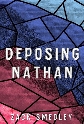
Two months later, the team produced the wonderful cover—a collection of paints, as a nod to my MC’s love of painting—that would become the face of the Advance Review Copies.

And for once–at long last–here was a task that was slated to be resolved simply, unanimously, and without stress.
But we know better than that by now, don’t we?
If you’ve kept up with this blog series, you’ll remember how I successfully pushed to keep the title DEPOSING NATHAN, despite the legal-ish vibes it gave off. A few days afterwards, Allison–my agent–got on the phone to warn me.
“Just so you’re prepared…there’s no way we can keep that cover if we’re using the existing title.”
“Why not?”
“A plain cover plus a title like that equals a legal handbook. No one will know that it’s YA.”
Lauren, along with Will—founder of Page Street and final authority on all this—jumped on the call to basically say the same thing: if we wanted to keep the title, we needed to angst-up the cover a bit.
As the one driving the bus on this decision (or at least pleading with everyone else on where to steer the bus), I can confirm that keeping the title–despite plunging our entire team into a months’-long crawl through the nine circles of literary hell–was the right decision, and I stand by it to this day.
That being said.
The subsequent endeavor to find a suitable face for NATHAN is what I–to say nothing of our poor, infinitely patient design team–would best characterize as an existential migraine so cosmically grueling that its sheer force could devour solar systems.
First up…
Me: “What if we just did an image of the piece of rainbow ceramic used to stabbed Nate?“
Allison/Lauren: “would look too much like a crime novel.”
Next, please.
Me: “Maybe stained glass? Bi colors? Here’s a quick concept.“
*Whisks dressing room curtains open*

Allison: “Pretty, but way too much of a ‘religious experience’ vibe.”
Next, please.
Lauren: “I saw one of the other preliminary covers and I wanted to get your thoughts. I know you said you aren’t into people on covers, so it’s okay if you don’t like it. We definitely want you to be happy with the cover.”

Me: “I’ll think through what else could work that fits both of our visions.”
NEXT PLEASE.
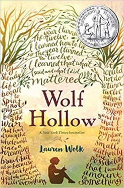
Me: “One compromise that *could* work Re: people on the cover would be if we used a silhouette of some kind, like Lauren Wolk’s WOLF HOLLOW.”

Lauren: “I do think the silhouette is a cool idea! We would just have to make sure it doesn’t come off with too much of a “crime” vibe.”
Cue five hours of me pecker-typing in my home drawing software like I had the first flying clue what I was doing.
Me, via email: “I found five similar titles and noticed a LOT of overlap in cover styles. Here’s a potential concept. If you’re not feeling this, totally fine. I want you to be comfortable with it. As always, thank you so much for working with me…it really means a lot.”

Me, in my own head:
Oh, NATHAN…what are we DOING to you.
Next.
I got an email from the Page Street design team. We’d all been at this for three MONTHS now, by the way.
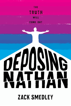
Page Street Design Team: “Please see attached and let us know your thoughts. We can switch it to any other neon color if you’d like. We really do like the pink.“

Okay…color tweaks aside, I thought the church thing (and design in general) was pretty awesome. Hell of a lot better than my mockup.
Allison hopped on real quick: “Hi Zack, I just wanted to let you know I personally recommend the plain pink.”
Next.

Me: “Thank you for sending! I do worry about losing some readership with the pink, so I think we should find something different.”
Design (probably): “Will someone, for the love of Zeus’s thundering butthole, end this ungodly nightmare.”
Next.
Me: “What about a vibrant blue like this one? I know that seems to be a popular color right now. Not sure if that would hurt or help us.”

Design: “We can definitely work on color. We loved the bright pink because it was so vibrant. We were actually thinking of using a neon ink, or something to make it really stand out, but there are other options other than pink as well. (See attached).“
Next.
This is–no joke–starting to leave me exhausted even recapping all this, so I’ll grant you the blissful respite of some quick summaries.
The above email chain grew to over 50 messages among 6 different people. I raised concerns about color. They mailed me physical samples–multiple times. I said no to the pink and no to purple. They said no to dark blue. We went over schedule and, I’m pretty sure, over budget. Everyone wanted this to thrive, and while no one was blaming each other, no one was finding a solution, either.
Allison let me know that she had never seen a publisher work so extensively with their author on the cover, and I needed to wrap this up.
I wasn’t going to. Not until we got this right. A wildly immature and somewhat inconsiderate attitude, for sure. I hated being the bitchy artist–there were a few nights where I legitimately lost sleep over how angry everyone must have been with me. But we were going to get this right if I had to raise enough hell to spawn the damn Antichrist.
The last Sunday of November, I spent most of the night crying in my room out of frustration. Which meant I called Allison on Monday. And this is what I told her.
I wrote this book for teenagers and parents who needed to be walked into the dark and shown things would be okay. Some of these readers would be teens who weren’t out to their families yet. I could not, and would never, let this book have a cover that queer boys would feel unsafe having on their bookshelves at home. I legitimately would sooner return my advance. No hot pink. No neon purple.
And Allison’s response was:
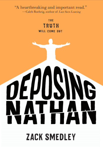
“Okay, Zack. I’m hearing you. How about…orange?”
Yes, seriously…it happened just like that. I thought it over; decided orange would be a comparatively safe color. I passed the verdict on to my publisher, who I can only imagine resembled that scene where the Houston control room finds out they’ve successfully rescued the goddamn Apollo 13.
And we had our cover.

I’ll avoid condescension or coyness and openly admit that, as you can likely tell, the cover isn’t exactly what I pictured for my book. And to this day, there are many things I love about it and a few things I don’t. My dream cover for it would have been a muted, abstract pallet like the ARC’s, but I made the decision to close that door when I pushed to keep the title. And as mentioned, I’d do it again no matter what.
Plus, it’s kind of my publisher’s first and only job to be good at this. And they are.
We locked in the final design the day before winter break, six months after I’d first sent my lists. I sent my Christmas present to Page Street, which was a mosaic collage of their company logo, made up of all the different covers we’d rotated through. With it, I included a note.
This year, your team gave me a voice in more ways than one. Thank you all.

What a remarkable journey you’ve been on. I’m with you – I feel like a pink cover would have really cut some people off from reading it. I think that you folks managed to get to the right cover 🙂
LikeLiked by 1 person
Thank you!! 🙂 I do 100% understand and agree that a plain cover (with the existing title) wouldn’t have sold well at all, and have had quite a few booksellers agree. So if nothing else, I absolutely think we have the best cover given the *circumstances*.
LikeLike
Oh, this is such a neat recap! Thanks for pushing so hard for a “safe design” for in the closet teens. That’s remarkably kind of you, and I really appreciate your hard work. Can’t wait to pick up your book!
LikeLike
Thank you so much for saying this, it means a lot 🙂 I’m so flattered that you intend to read the book and I really hope you enjoy it!
LikeLiked by 1 person